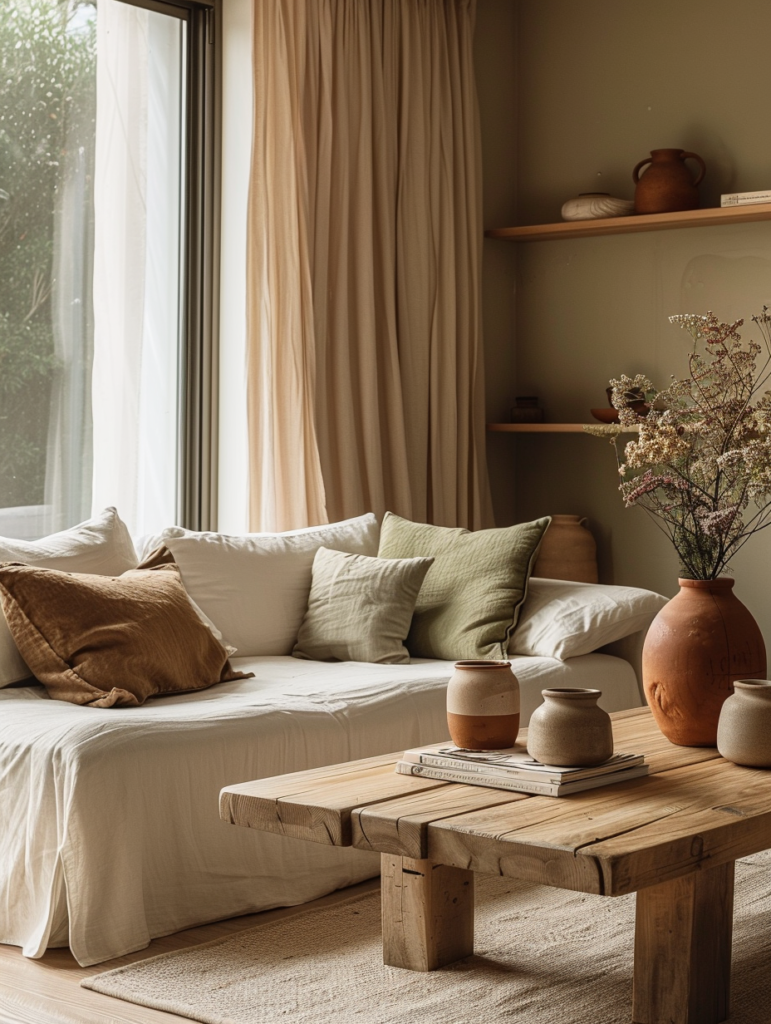
In the evolving world of refined interiors, few aesthetics capture the perfect balance of calm, craftsmanship, and understated elegance quite like Japandi. The mood board above beautifully illustrates this philosophy: a thoughtfully curated palette of warm terracotta, soft olive, sage green, serene gray, and layered off-whites, paired with natural linen, raw wood, matte ceramics, and dried botanical elements. The word “JAPANDI” sits prominently, reminding us that this is not merely a trend — it is a lifestyle rooted in Japanese minimalism and Scandinavian functionality, reinterpreted for the modern quiet luxury home.
This comprehensive guide explores the Japandi color palette in depth for 2026. We will examine its philosophy, the exact color families shown in the image, material pairings, room-by-room applications, styling techniques, and how this aesthetic seamlessly integrates with the quiet luxury principles you already embrace in your wardrobe, bathroom counters, and whole-house color schemes. Whether you are refreshing a single room or designing an entire home, this palette offers enduring sophistication that feels both grounded and elevated.
The Philosophy of Japandi: Where Japanese Restraint Meets Scandinavian Warmth
Japandi is the harmonious marriage of two design traditions: Japan’s wabi-sabi (appreciating imperfection and transience) and Scandinavia’s hygge (creating cozy, functional comfort). In 2026, this fusion has matured into the ultimate expression of quiet luxury — a style that values negative space, natural materials, and emotional calm over ornamentation.
Unlike maximalist or overly minimalist trends of the past, Japandi feels lived-in yet intentional. The mood board captures this perfectly: warm terracotta brings earthy energy, olive and sage greens connect us to nature, soft grays and off-whites provide breathing room, and raw wood and linen add tactile warmth. There is no shouting for attention — only a gentle invitation to slow down and appreciate the beauty of simplicity.
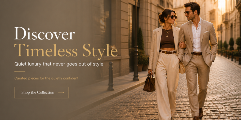
This aesthetic aligns perfectly with the Old Money and Quiet Luxury ethos that defines your website. Just as a perfectly tailored cashmere sweater or a harmonious Pashmina greige wall feels expensive because of its restraint, Japandi colors create spaces that whisper refinement rather than announce it. It is the visual equivalent of a capsule wardrobe: fewer, better pieces that work together effortlessly.
Breaking Down the Japandi Color Palette in the Mood Board
The image presents a masterful 2026-ready palette. Here is a detailed analysis of each shade and how it functions:
1. Soft (Warm Terracotta / Clay) A rich, earthy terracotta that sits between rust and soft peach. This is the hero accent color — warm enough to energize a space without overwhelming it. It pairs beautifully with wood tones and brings a subtle glow that mimics sunlight on clay walls in traditional Japanese homes.
2. Terracott A slightly deeper, more muted terracotta with brown undertones. This shade adds depth and grounding. Use it sparingly on accent walls, textiles, or ceramic pieces to create visual weight and warmth.
3. Olive A sophisticated olive green with gray undertones. This is the palette’s connection to nature — evoking moss, olive groves, and Japanese tea gardens. It bridges warm and cool tones, making it incredibly versatile for both modern and traditional Japandi spaces.
4. Sage / Light Sage Green A softer, more muted sage that feels calming and fresh. This shade appears as the fourth swatch and provides gentle contrast against the terracottas and neutrals. It is ideal for larger surfaces such as walls or upholstery.
5. Saxlvr Gray (Saxony Gray / Warm Gray) A mid-tone warm gray with subtle beige undertones. This acts as the perfect neutral bridge — neither too cool nor too warm — allowing the bolder terracotta and olive tones to stand out while maintaining harmony.
6. Setsdey (Soft Stone Gray) A lighter, almost silvery gray with a hint of warmth. This shade adds modern sophistication and works beautifully as a secondary neutral for cabinetry or larger furniture pieces.
7. Off White / Of White The purest, softest off-white with a hint of warmth. This is the foundation color — used for ceilings, trim, and large expanses of fabric or walls. It prevents the palette from feeling heavy while reflecting light beautifully.
Together, these colors create a cohesive, layered story that feels organic and collected over time.
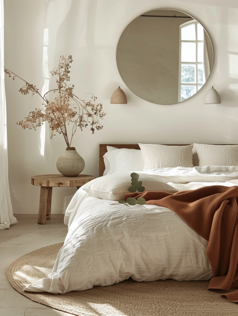
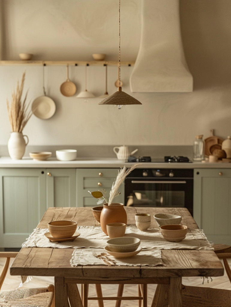
Materials & Textures That Complete the Japandi Look
The mood board expertly demonstrates the importance of texture in Japandi design:
- Linen & Organic Cotton: The draped fabrics in soft gray and beige add movement and softness.
- Raw Wood: Driftwood pieces and live-edge slabs introduce organic imperfection and warmth.
- Matte Ceramics: The speckled bowls and vessels provide tactile interest and a handcrafted feel.
- Dried Botanicals: Tall grasses and eucalyptus bring nature indoors without maintenance demands.
- Stone & Clay: Natural stone elements reinforce the earthy, grounded quality of the palette.
These materials ensure the space feels warm, inviting, and deeply sensory — the opposite of cold, glossy minimalism.
Room-by-Room Application Guide for 2026
Living Room Use the off-white as the main wall color, olive or sage on one accent wall, and terracotta through cushions or a statement ceramic vessel. Layer linen sofas, raw wood coffee tables, and plenty of negative space.
Bedroom Soft sage or Saxony gray walls create a cocooning effect. Add terracotta through bedding or a throw, and finish with off-white linen curtains and wooden bedside tables.
Kitchen / Dining Off-white or light sage cabinetry paired with warm wood countertops and terracotta accents in dinnerware. The olive tone can appear in plants or a backsplash.
Bathroom This palette pairs perfectly with your serene bathroom counter aesthetic. Use off-white walls, sage or olive towels, terracotta soap dishes, and brass accents for warmth.
Home Office Saxony gray or Setsdey walls promote focus while terracotta and olive bring calm energy.
Entryway / Hallway Terracotta or olive as an accent wall creates instant warmth and welcome.
Styling Tips for Effortless Japandi Elegance
- Rule of Three: Limit each surface to three carefully chosen objects.
- Negative Space is Luxury: Leave areas intentionally empty to let the eye rest.
- Layer Textures: Always combine smooth (ceramic) with rough (wood, linen, dried grass).
- Lighting Matters: Use warm 2700K lighting and multiple sources — wall sconces, table lamps, and natural light.
- Seasonal Rotation: Swap dried botanicals and one or two textiles quarterly to keep the space feeling fresh without changing the core palette.
Why Japandi Feels So Right in 2026
After years of maximalism and digital overload, homeowners are craving calm, authenticity, and connection to nature. Japandi delivers exactly that. It is sustainable (natural materials, timeless colors), emotionally supportive (calming tones), and visually sophisticated (layered neutrals that never date).
This palette also creates perfect continuity with your existing quiet luxury themes:
- It works beautifully with Pashmina greige and Shoji White walls.
- The terracotta and olive tones complement your botanical green & white floral nails and celestial blue & gold evening looks.
- The overall restraint mirrors the serene bathroom counter decor you already love.
Conclusion: Building a Home That Feels Like a Deep Breath
The Japandi color palette shown in the mood board is more than a collection of paint swatches — it is an invitation to live with greater intention, calm, and beauty. By embracing these earthy neutrals, natural textures, and thoughtful negative space, you create rooms that nurture rather than overwhelm.
In 2026 and beyond, true luxury is not loud. It is the quiet confidence of a home that feels warm, grounded, and deeply personal. Start with one room. Choose your hero color. Layer the textures. Let the space breathe. Over time, you will discover that Japandi is not just a style — it is a way of living that honors simplicity, nature, and the refined art of everyday elegance.
Your home deserves to feel this peaceful. Your daily rituals deserve this level of beauty. And you deserve the quiet joy that comes from surrounding yourself with colors and materials that feel like a gentle, continuous embrace.