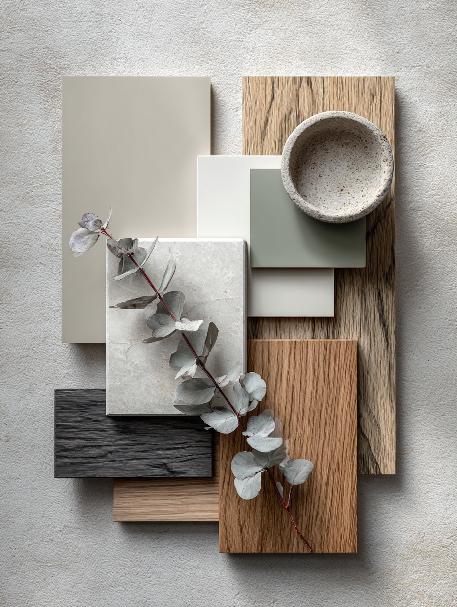
In the pursuit of refined living, nothing unifies a home more elegantly than a whole house color palette that flows seamlessly from room to room. The image above captures a masterfully curated material and paint board — a perfect example of modern quiet luxury design that blends warm neutrals, soft greens, deep charcoals, and natural wood tones.
This palette embodies Old Money restraint and Quiet Luxury sophistication: no loud statements, just thoughtful layers of texture, light, and depth. Benjamin Moore’s Pashmina AF-100 serves as the hero greige for laundry areas, paired with Sherwin-Williams Shoji White SW 7042 for crisp yet warm cabinetry, Benjamin Moore Vineland CC-722 for earthy pantry tones, Sherwin-Williams Iron Ore SW 7069 for moody office or powder room drama, and Medium Stain Oak for rich kitchen island and cabinet warmth.
This comprehensive guide (over 2,500 words) breaks down this beautiful palette, explains why it works so well in 2026, provides room-by-room application tips, and offers practical advice for creating your own harmonious home. Whether you’re planning a full renovation or a subtle refresh, this sophisticated neutral scheme delivers timeless elegance with modern livability.
The Power of a Cohesive Whole House Color Palette
A successful whole house palette creates visual flow in open-concept homes while allowing subtle personality in individual rooms. The mood board shown uses a restrained, high-end mix:
- Warm Greige Neutrals (Pashmina) for softness and versatility
- Off-White with warmth (Shoji White) for brightness without starkness
- Earthy Green-Gray (Vineland) for natural grounding
- Deep Charcoal (Iron Ore) for sophisticated contrast
- Natural Wood (Medium Stain Oak) for organic texture and warmth
This combination feels expensive yet approachable — exactly the essence of quiet luxury. In 2026, homeowners favor palettes that age gracefully, work with natural light variations, and pair beautifully with linen, oak, marble, and brass details.
Breaking Down the Palette: Colors, Undertones & Best Uses
1. Laundry – Pashmina AF-100 (Benjamin Moore) A sophisticated warm greige with subtle beige undertones. Balanced between light and medium, it creates a calm, spa-like atmosphere in high-use areas like the laundry room. It hides imperfections well and pairs elegantly with white trim or wood accents.
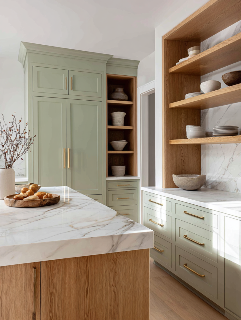
2. Cabinets – Shoji White SW 7042 (Sherwin-Williams) A soft, warm off-white that leans slightly greige. Unlike bright whites, Shoji White feels cozy and refined — ideal for kitchen or bathroom cabinets. It reflects light beautifully while adding subtle depth.
3. Pantry – Vineland CC-722 (Benjamin Moore) A versatile green-gray with earthy, verdant undertones — like wet stone or mossy earth. This muted green brings calm and nature indoors, making pantries or mudrooms feel grounded and serene.
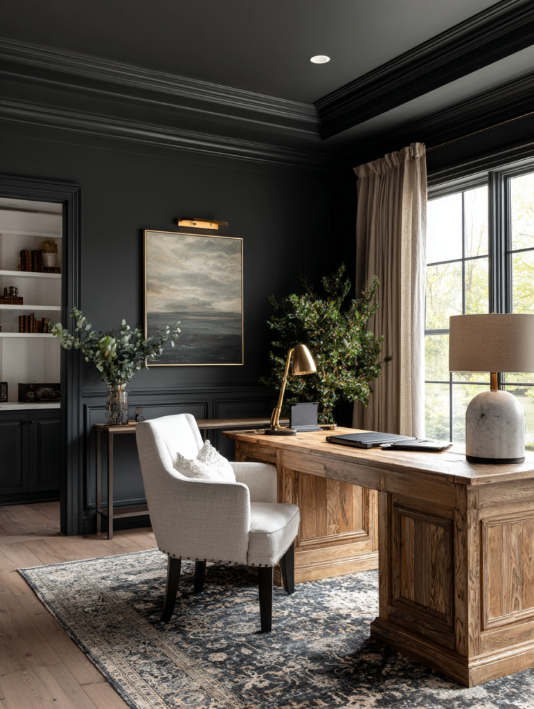
4. Office/Powder Room – Iron Ore SW 7069 (Sherwin-Williams) A deep, mysterious charcoal with cool undertones. Used strategically, it adds dramatic elegance and sophistication without making spaces feel dark. Perfect for small rooms or accent walls where you want quiet luxury impact.
5. Kitchen Island & Cabinets – Medium Stain Oak Warm medium-stained oak brings natural texture and richness. It contrasts beautifully with painted surfaces, adding warmth and preventing the palette from feeling too cool or flat.
Supporting Elements: The mood board includes a textured ceramic bowl and delicate eucalyptus, hinting at layered materials — stone, wood, linen, and greenery — that complete the quiet luxury look.
Why This Palette Feels Timeless in 2026
This scheme moves away from the cool grays of the past decade toward warmer, more human neutrals. Pashmina and Shoji White provide a soft foundation, Vineland adds organic calm, Iron Ore delivers refined depth, and oak grounds everything in natural beauty.
It aligns perfectly with Quiet Luxury principles: restraint, quality materials, and emotional comfort. The palette works exceptionally well with:
- Natural oak or walnut flooring
- Marble or quartz countertops
- Linen and wool textiles
- Brass or matte black hardware
- Abundant greenery and fresh flowers
Room-by-Room Application Guide
Laundry Room Use Pashmina on walls for a serene, elevated utility space. Pair with Shoji White cabinets or trim. Add open shelving in Medium Stain Oak for warmth.
Kitchen Paint perimeter cabinets in Shoji White. Use Medium Stain Oak on the island for contrast and visual interest. Consider Vineland on a pantry door or accent wall for subtle color.
Pantry / Mudroom Vineland creates a calming, earthy backdrop. Combine with Shoji White shelving and oak elements for practical elegance.
Home Office or Powder Room Iron Ore delivers instant sophistication. Use it on walls with Shoji White trim and oak accents. In powder rooms, it creates a jewel-box effect that feels expensive.
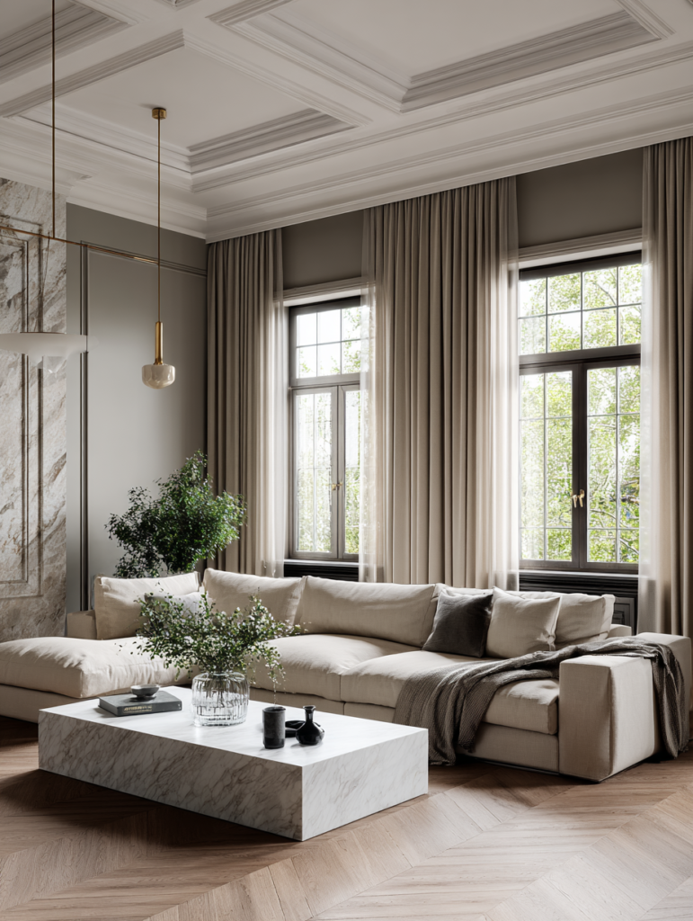
Living Areas & Bedrooms Extend Pashmina or a lighter version as the main wall color. Use Shoji White on ceilings and trim for brightness. Add oak furniture and Vineland accents through artwork or textiles.
Whole House Flow Tips
- Keep ceilings and trim consistently in Shoji White or a lighter neutral.
- Vary intensity: lighter tones in small or low-light rooms, deeper tones (Iron Ore) in well-lit or smaller spaces.
- Use the same wood stain (Medium Oak) across kitchen, built-ins, and flooring for cohesion.
Styling & Material Recommendations
To enhance this palette:
- Floors: Light to medium oak or wide-plank engineered wood.
- Countertops: White or light gray marble/quartz with subtle veining.
- Hardware: Matte brass or brushed nickel for warmth.
- Fabrics: Linen, bouclé, and cashmere in ivory, sage, and warm taupe.
- Lighting: Warm 2700K bulbs and layered fixtures (pendants, sconces, table lamps).
Test samples thoroughly in your actual lighting — north-facing rooms may need warmer tones, while south-facing spaces handle deeper colors like Iron Ore beautifully.
Practical Implementation Advice
- Order Samples — Always test large peel-and-stick samples (Samplize) on multiple walls at different times of day.
- Sheen Selection — Eggshell or satin for walls; semi-gloss for trim and cabinets.
- Budget Phasing — Start with main living areas, then extend the palette to secondary rooms.
- Sustainability — Choose low-VOC paints from Benjamin Moore or Sherwin-Williams for a healthier home.
- Professional Help — Consider a color consultant if combining multiple rooms feels overwhelming.
The Future of Neutral Palettes: Warmth & Intention
In 2026, the most desirable homes feel personal yet timeless. This Pashmina-led palette with Shoji White, Vineland, Iron Ore, and oak delivers exactly that — a sophisticated, livable backdrop for quiet luxury living that will never feel dated.
It proves that true elegance comes from harmony, not flash. By layering these thoughtful neutrals and natural materials, your home becomes a sanctuary of calm confidence.
Conclusion: Create Your Own Timeless Sanctuary
The mood board in the image represents more than colors — it represents a lifestyle of intention, refinement, and enduring beauty. Whether you adopt this exact scheme or use it as inspiration, a well-planned whole house palette transforms houses into homes that feel expensive, peaceful, and deeply personal.
Start small: choose your hero color (perhaps Pashmina), test it thoroughly, and build outward. In time, you’ll create spaces that whisper quiet luxury every single day.