
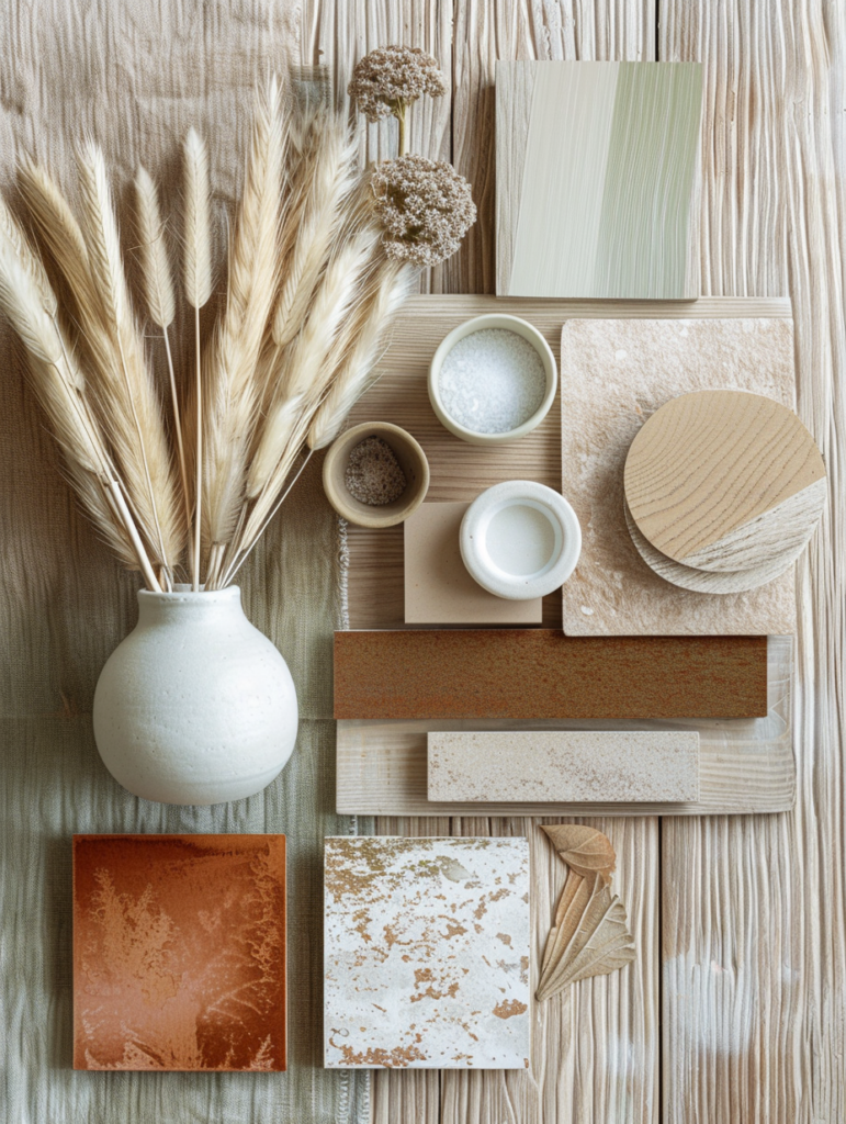
In the ever-evolving landscape of interior design, certain palettes possess a rare quality: they transcend trends and feel eternally relevant. The mood board above captures one such palette — a sophisticated symphony of warm browns, soft beiges, sage greens, and creamy neutrals that together create what is elegantly labeled “Paleta de Cores Atemporal” (Timeless Color Palette). This is not a fleeting seasonal trend. It is a refined, enduring aesthetic that embodies the very essence of Quiet Luxury in 2026: warmth without excess, depth without darkness, and serenity without sterility.
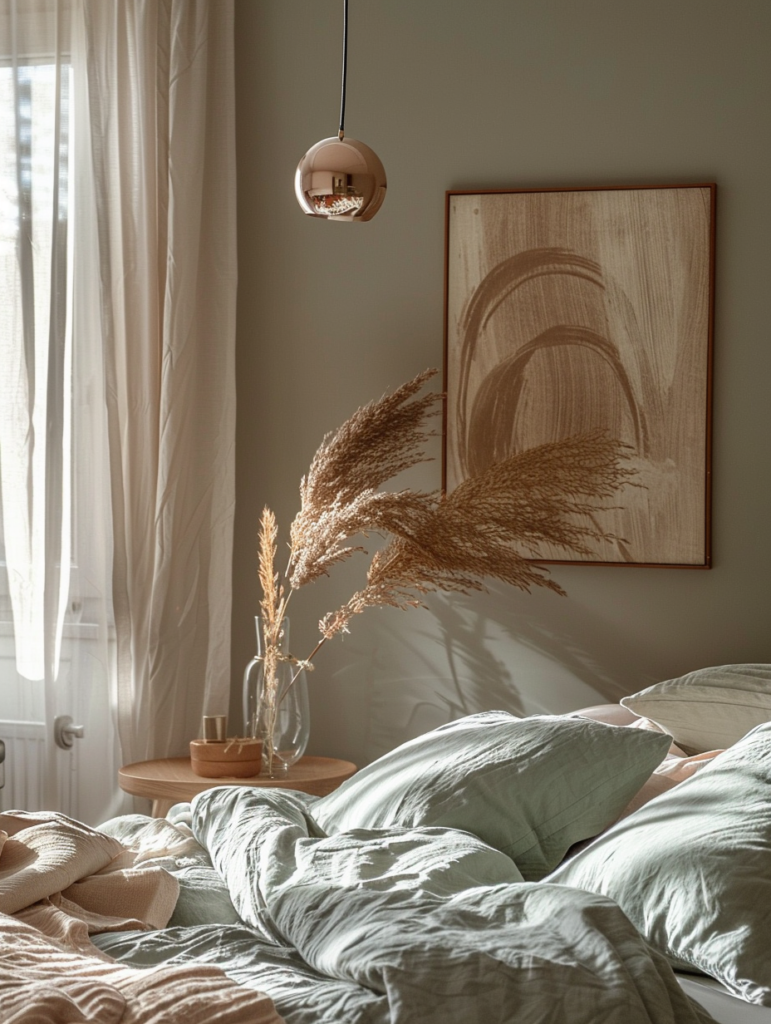
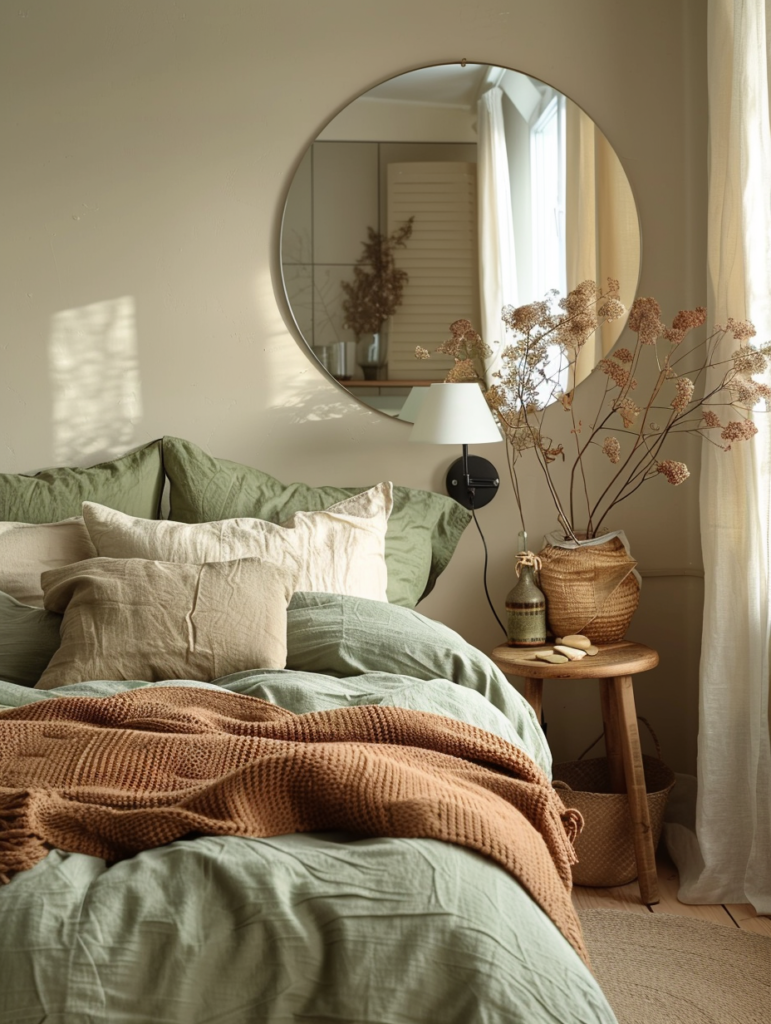
The image presents a serene bedroom scene where these colors come to life. A rich terracotta-brown wall serves as the backdrop, complemented by layered bedding in sage green and soft peach tones, light oak furniture, abstract art in muted earth hues, and delicate pampas grass that adds organic movement. The hex codes — #8E6E54, #AB8A6B, #6D7961, #7C8F73, #6E543C, and #CDB79E — form a cohesive family that feels both grounded and elevated, perfectly suited for bedrooms, living spaces, and the modern home seeking lasting beauty.
This comprehensive guide delves deeply into this timeless color palette. We explore its design philosophy, the emotional and practical power of each shade, room-by-room applications (with special emphasis on bedrooms), material pairings, styling techniques, and why this exact combination is experiencing a powerful resurgence in 2026 among those who value quiet luxury, Japandi-inspired calm, and Old Money refinement.
The Philosophy of a Truly Timeless Color Palette
A timeless palette is not defined by what is popular this year, but by what will still feel beautiful a decade from now. This “Paleta de Cores Atemporal” succeeds because it draws from nature’s most enduring tones: the warm bark of ancient trees, the soft clay of riverbanks, the muted greens of sagebrush after rain, and the creamy lightness of sun-bleached linen.
In 2026, homeowners are consciously moving away from stark whites and cool grays toward warmer, more human neutrals. This palette delivers exactly that — emotional warmth paired with sophisticated restraint. It aligns seamlessly with the quiet luxury ethos that runs through your previous articles: the same restraint seen in your Japandi material mood boards, the serene bathroom counters, and the classic outfit flat lays.
The power of this palette lies in its versatility and emotional intelligence:
- Warmth: The terracotta and beige tones create a cocooning, welcoming feeling.
- Calm: The sage greens introduce a natural, restorative energy.
- Depth: The darker brown provides grounding and contrast without heaviness.
- Lightness: The soft beige and off-white prevent the scheme from feeling heavy.
This balance creates spaces that feel expensive not because of opulence, but because of intentional harmony.
Detailed Breakdown of the Palette
Each color in this palette has been thoughtfully chosen. Here is a professional analysis:
1. #8E6E54 – Warm Terracotta Brown (Hero Accent) This rich, earthy brown serves as the strongest color in the palette. It adds depth and character while remaining warm and inviting. In the mood board, it appears as the main wall tone. It is grounding yet sophisticated — perfect for feature walls, headboards, or large furniture pieces.
2. #AB8A6B – Soft Beige / Camel A gentle, slightly golden beige that acts as a bridge between the warmer and cooler tones. This shade brings softness and light reflection, making rooms feel larger and more luminous. Use it for ceilings, trim, or large textiles.
3. #6D7961 – Muted Sage Green This is the palette’s connection to nature. A sophisticated sage with gray undertones, it provides calm and freshness without being cold. In the bedroom scene, it appears in the bedding, adding a restful, biophilic quality.
4. #7C8F73 – Lighter Sage Green A softer, slightly brighter version of the sage. It adds subtle variation and prevents the palette from feeling flat. Ideal for accent pillows, throws, or secondary walls.
5. #6E543C – Deep Warm Brown A darker, more intense brown that provides contrast and depth. It grounds the lighter tones and adds a sense of richness. Excellent for nightstands, frames, or leather accents.
6. #CDB79E – Creamy Off-White / Light Beige The lightest shade in the family. It serves as the perfect neutral foundation, reflecting light and creating breathing room. Use it for bedding bases, curtains, or ceilings.
Together, these six colors create a layered, harmonious story that feels collected rather than coordinated.
Room-by-Room Application Guide
Master Bedroom (The Star Application) As shown in the mood board, this palette creates the ultimate restful sanctuary. Paint the main wall in #8E6E54 terracotta brown. Use the sage greens (#6D7961 and #7C8F73) for bedding and throws. Light oak nightstands and creamy off-white linens complete the look. Add abstract art in soft earth tones and dried pampas grass for organic texture.
Guest Bedroom Soften the palette further by using the lighter beige (#AB8A6B) as the dominant wall color and sage green for accent pillows. This creates a welcoming, hotel-like calm.
Living Room Use the terracotta brown on one accent wall and the sage greens on upholstery. The creamy beige works beautifully on large sofas or curtains, while the deep brown adds warmth through leather armchairs or wooden beams.
Home Office The muted sage green promotes focus and calm. Pair it with the warm terracotta for energy and the light beige for brightness.
Dining Area Terracotta brown on the walls paired with light oak furniture and sage green table linens creates an inviting, sophisticated gathering space.
Bathroom This palette pairs beautifully with your previous serene bathroom and chic mint/coral articles. Use the sage greens for towels and the terracotta for accent tiles.
Material & Texture Recommendations
To bring this palette to life, focus on tactile contrast:
- Wood: Light oak or walnut for furniture and flooring.
- Textiles: Linen, wool, and cashmere in the sage and beige tones.
- Stone/Ceramic: Matte ceramics and soft marble for accessories.
- Metals: Warm brass or matte black for lighting and hardware.
- Plants: Dried pampas grass, eucalyptus, or olive branches for organic movement.
Why This Palette Is Going Viral in 2026
This “Paleta de Cores Atemporal” resonates so strongly because it answers the current desire for calm, authenticity, and emotional comfort. In a fast-paced world, people want homes that feel like a deep breath. The warm, earthy tones provide that grounding energy, while the sage greens add a restorative quality.
It also creates perfect continuity with your existing quiet luxury themes:
- It builds on the Japandi material mood board with similar earthy neutrals.
- It complements the serene bathroom counters and chic mint/coral palettes.
- It pairs effortlessly with the classic outfit flat lays and botanical nail art.
Conclusion: A Palette That Ages Beautifully
The timeless color palette shown in this mood board is more than a collection of hex codes — it is an invitation to create spaces that nurture, calm, and inspire for years to come. By embracing these warm earth tones, layered neutrals, and organic textures, you build a home that feels expensive not through extravagance, but through intention and harmony.
Start with one room — perhaps the bedroom, as the mood board so beautifully demonstrates. Choose your hero color. Layer the tones thoughtfully. Let the space breathe. Over time, you will discover that this palette is not just beautiful — it is transformative.
In 2026 and beyond, true luxury is found in the quiet details: the soft glow of light on terracotta walls, the gentle texture of sage green linen, the warmth of a creamy beige throw. This timeless palette invites you to slow down, breathe deeply, and surround yourself with colors that feel like a continuous, gentle embrace.
Your home deserves this level of beauty. Your daily life deserves this level of calm. And you deserve the quiet joy that comes from living in spaces designed with such refined intention.