
In the refined world of contemporary design, few aesthetics achieve such perfect equilibrium between minimalism and warmth as Japandi. The mood board above is a masterclass in this philosophy — a carefully composed arrangement of materials and colors that speaks volumes without raising its voice. A soft beige panel anchors the composition, while a crisp white square, sage-green rectangle, terracotta woven fabric, black textured panel, light wood accent, matte ceramic bowl, and delicate eucalyptus branches create a harmonious dialogue between nature, tactility, and restraint.
This is not merely a collection of swatches. It is a complete sensory language for 2026 interiors — one that bridges Japanese wabi-sabi and Scandinavian functionality while embracing the quiet luxury values of intention, quality, and emotional calm. This comprehensive guide explores the Japandi material mood board in depth: its design philosophy, the specific elements shown, how to translate them into real spaces, practical applications across rooms, and why this exact combination feels so right for the modern refined home.
The Philosophy of Japandi Materials in 2026
Japandi design has matured significantly by 2026. It is no longer just “Japanese minimalism meets Scandinavian hygge.” It has become the ultimate expression of quiet luxury: spaces that feel collected over time rather than decorated, where every texture tells a story and every color feels grounded in nature.
The mood board perfectly illustrates this evolution:
- Restraint with richness — no bright colors, only nuanced neutrals and earthy tones.
- Tactile contrast — smooth ceramic against rough woven fabric, matte paint against textured wood.
- Biophilic connection — living eucalyptus branches that soften hard surfaces and bring the outside in.
- Negative space — the arrangement leaves room to breathe, creating visual calm.
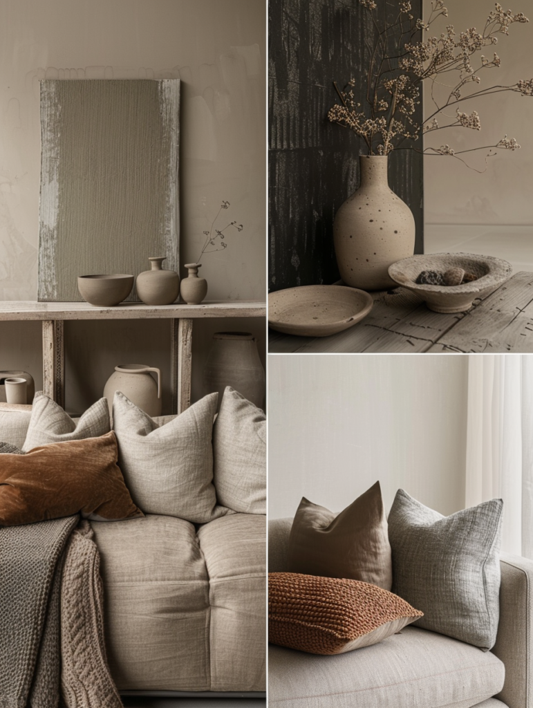
This aesthetic aligns seamlessly with the Old Money and Quiet Luxury principles explored in your previous articles. Just as a perfectly tailored cashmere sweater or a serene bathroom counter feels expensive because of its restraint, these materials create rooms that whisper sophistication rather than announce it.
In 2026, homeowners are moving away from cold, glossy minimalism toward warmer, more human environments. The palette and textures in this mood board deliver exactly that — a home that feels expensive, peaceful, and deeply personal.
Detailed Breakdown of the Mood Board Elements
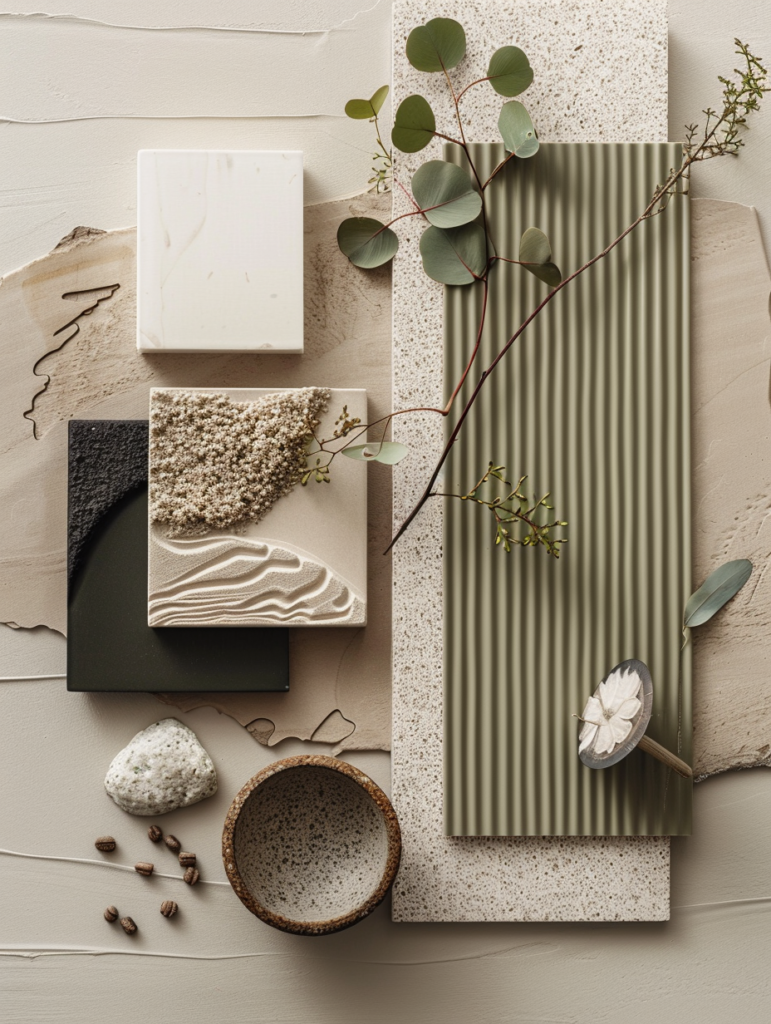
Every piece in the composition serves both aesthetic and functional purposes. Here is a professional analysis of each component:
1. Soft Beige / Warm Neutral Panel (Top Center) This large beige panel acts as the hero foundation color. It is warm enough to feel inviting yet neutral enough to work as a backdrop for everything else. In real spaces, this translates to walls painted in a soft greige or warm off-white (similar to Pashmina AF-100). It reflects light gently and makes the other elements pop without competing.
2. Crisp White Square (Left Center) The bright white square provides necessary contrast and breathing room. It prevents the palette from feeling heavy. Use this shade for trim, ceilings, or smaller accent pieces (cabinetry, ceramic bowls, or textiles) to maintain visual lightness.
3. Sage Green / Olive Panel (Bottom Left) This muted sage-green rectangle is the mood board’s connection to nature. It brings a calming, grounded energy while adding subtle depth. In interiors, this color works beautifully on accent walls, kitchen cabinetry, or upholstered pieces.
4. Terracotta Woven Fabric (Bottom Right) The rust-toned woven textile introduces warmth, texture, and subtle pattern. This is the mood board’s “soul” element — it adds organic imperfection and tactile interest. Use it for upholstery, curtains, rugs, or throw pillows to ground the cooler neutrals.
5. Black Textured Panel (Right Center) The vertically ribbed black panel provides dramatic contrast and modern edge. It is not harsh black but a deep charcoal with texture, preventing the palette from becoming too soft. Perfect for accent walls, kitchen islands, or statement furniture.
6. Light Wood Accent (Top Right) The slim wood panel adds natural warmth and organic grain. It balances the cooler tones and reinforces the Japandi connection to natural materials. Use similar light oak or walnut for flooring, shelving, or furniture.
7. Matte Ceramic Bowl (Center) The speckled ceramic bowl embodies wabi-sabi — imperfect, handmade, and deeply tactile. Ceramics like this are essential in Japandi design because they bring humanity and imperfection into minimalist spaces.
8. Eucalyptus & Dried Botanicals The fresh eucalyptus branch is the living element that ties everything together. It adds movement, softness, and biophilic beauty. In real homes, rotate fresh or dried stems seasonally to keep the space feeling alive.
Together, these elements create a palette that feels both modern and timeless — exactly what discerning homeowners seek in 2026.
Room-by-Room Application: Bringing the Mood Board to Life
Living Room Use the beige panel as the main wall color. Add the sage green on one accent wall or sofa. Layer the terracotta fabric on cushions or a throw. Incorporate the black textured panel as a media unit or fireplace surround. Finish with light wood coffee tables and plenty of ceramic accessories.
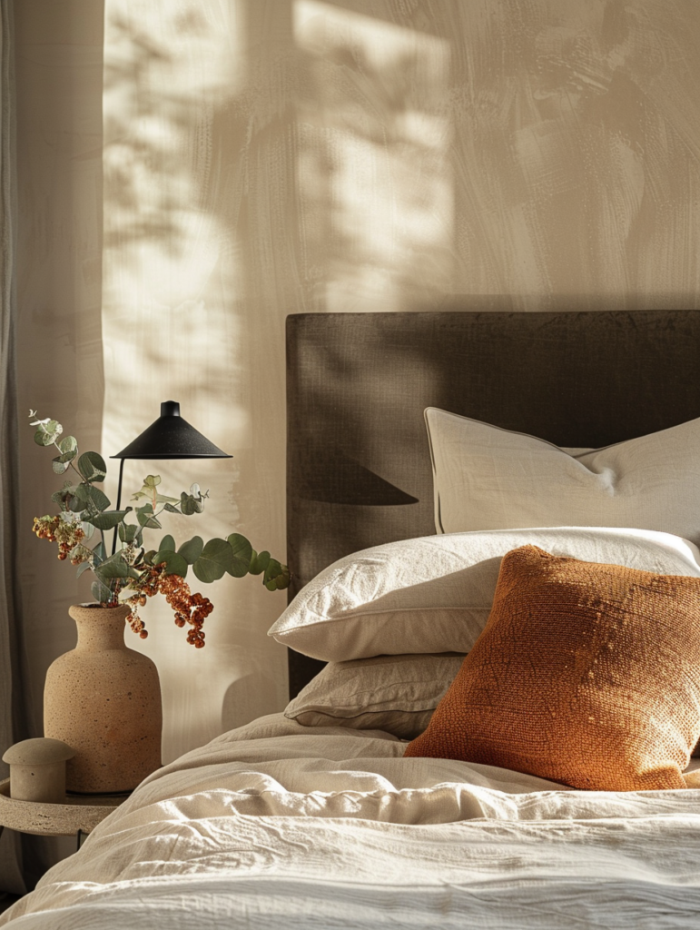
Bedroom Paint walls in the soft beige or off-white. Use sage green or terracotta for bedding or an accent chair. The black panel works beautifully as a headboard accent. Add light wood bedside tables and matte ceramic lamps for warmth.
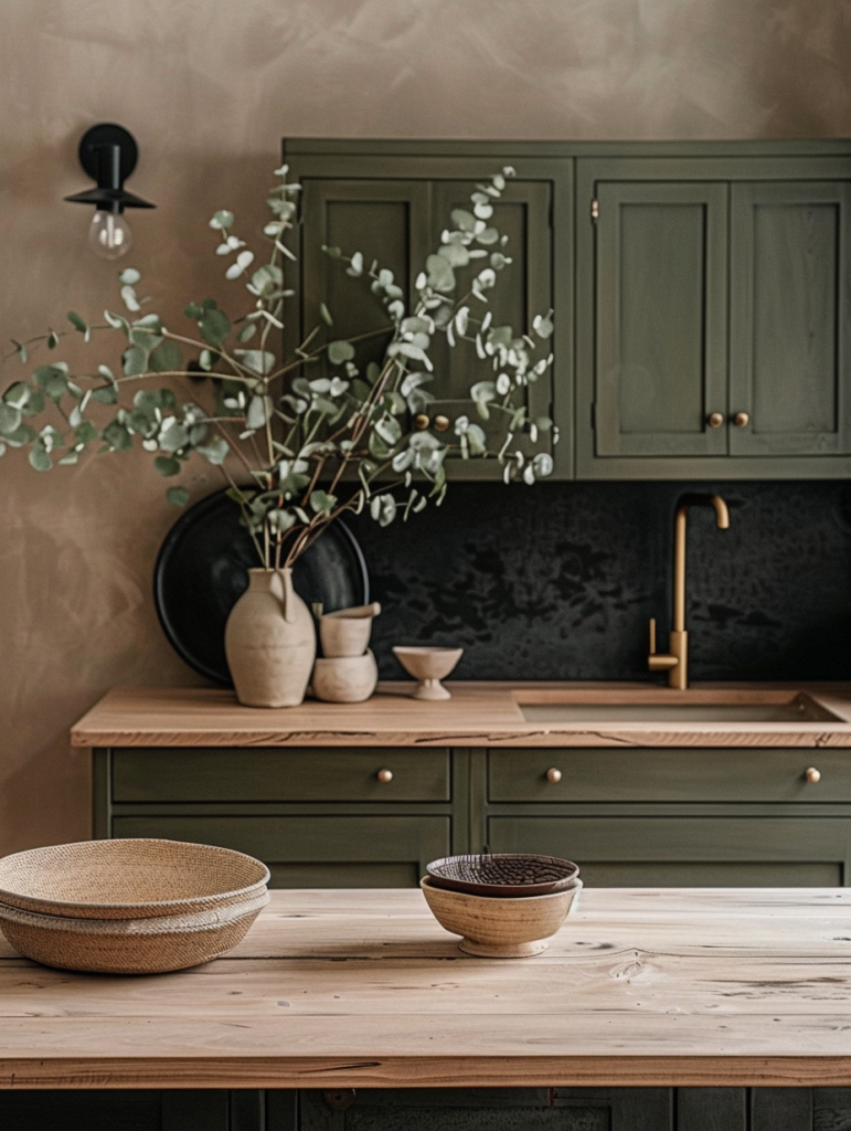
Kitchen Sage green or off-white cabinetry paired with light wood countertops. Use the terracotta fabric for bar stools or curtains. The black textured panel makes an excellent backsplash or island front. Display ceramic bowls and fresh greenery on open shelves.
Bathroom This palette pairs perfectly with your serene bathroom counter aesthetic. Use beige walls, sage green towels, terracotta soap dishes, and black textured accents for hardware or a feature wall. Light wood shelving and matte ceramics complete the spa-like feel.
Dining Area Light wood dining table with terracotta upholstered chairs. Beige walls and sage green accents through plants or ceramics. The black panel can appear as a sideboard or feature wall.
Entryway The terracotta fabric as a bench cushion or rug. Sage green or beige walls. Light wood console table with ceramic vases and eucalyptus branches for instant welcome.
Styling Techniques for Authentic Japandi Harmony
- Layer Textures: Always combine smooth (ceramic, paint) with rough (woven fabric, wood grain, textured black panel).
- Negative Space Rule: Leave at least 30–40% of surfaces intentionally empty.
- Lighting Strategy: Use warm 2700K–3000K lighting from multiple sources — wall sconces, under-shelf LEDs, and natural light.
- Seasonal Rotation: Swap eucalyptus for dried lunaria in autumn or olive branches in winter to keep the space feeling fresh.
- Scale Balance: Mix large panels (beige, black) with small details (ceramic bowl, single eucalyptus stem).
Why This Mood Board Feels So Right in 2026
After years of digital overload and maximalist trends, people are craving calm, authenticity, and connection to nature. This Japandi material palette delivers exactly that — sustainable, emotionally supportive, and visually sophisticated. The colors and textures age gracefully, develop patina, and improve with time, making them true investments rather than temporary trends.
It also creates perfect continuity with your existing quiet luxury themes:
- It complements the Pashmina greige and Shoji White palettes from your whole-house color guides.
- It echoes the organic feel of your botanical green & white floral nail art.
- It aligns with the calm serenity of your bathroom counter decor.
Conclusion: Creating Spaces That Feel Like a Gentle Embrace
The Japandi material mood board shown here is more than decoration — it is a complete design language for living with greater intention, calm, and beauty. By embracing these earthy neutrals, layered textures, and natural elements, you create rooms that nurture rather than overwhelm.
In 2026 and beyond, true luxury is found in the quiet moments: the soft glow of light on matte ceramic, the gentle movement of eucalyptus leaves, the warmth of terracotta against skin. This mood board invites you to slow down, breathe deeply, and appreciate the beauty of simplicity.
Start with one room. Choose your foundation color. Layer the textures thoughtfully. Let the space breathe. Over time, you will discover that Japandi is not just a style — it is a way of living that honors nature, craftsmanship, and the refined art of everyday elegance.
Your home deserves to feel this peaceful. Your daily life deserves this level of beauty. And you deserve the quiet joy that comes from surrounding yourself with materials and colors that feel like a continuous, gentle embrace.