
In the world of interior design, nothing unifies a home quite like a thoughtfully curated color harmony palette. Gone are the days of mismatched rooms or trend-chasing hues that feel dated within a season. Today’s discerning homeowners—whether embracing Old Money elegance, Quiet Luxury minimalism, or a blend of timeless sophistication with modern warmth—seek paint schemes that create seamless flow, emotional calm, and lasting beauty across every square foot.
A whole house paint palette typically includes 5–7 harmonious colors: a dominant wall color, secondary tones, trim and ceiling shades, and strategic accents. These palettes draw from color theory principles—analogous schemes for gentle flow, complementary contrasts for subtle drama, and monochromatic layers for refined depth. In 2026, the emphasis is on warm neutrals, earthy tones, and grounded elegance that echo the restraint of quiet luxury while incorporating trendy yet livable shades like soft khakis, olive greens, creamy ivories, and moody charcoals.
This comprehensive guide (over 2,500 words) explores the art of color harmony, why whole-house palettes matter, the psychology behind successful schemes, must-have 2026 colors from major brands, four curated palettes tailored for different aesthetics, room-by-room application tips, and practical advice for implementation. Whether you’re building a new home, refreshing an existing one, or simply elevating your space, these palettes deliver timeless appeal with just the right touch of contemporary relevance.
The Foundations of Color Harmony in Interior Design
Color harmony isn’t accidental—it’s rooted in the color wheel and proven design rules. Analogous colors (neighbors on the wheel, like warm beiges and soft taupes) create peaceful, cohesive spaces ideal for open-concept living. Complementary pairs (opposites, such as soft blues and warm terracotta) add balanced energy without clashing. Monochromatic schemes layer tints, tones, and shades of one base hue for sophisticated depth.
The golden 60-30-10 rule remains essential: 60% dominant color (walls and large surfaces), 30% secondary (upholstery, curtains), and 10% accent (artwork, pillows, hardware). For whole-house harmony, limit your palette to 5–7 colors total. This prevents visual chaos while allowing subtle variation room-to-room—lighter shades in small or north-facing spaces, deeper tones in larger or well-lit areas.
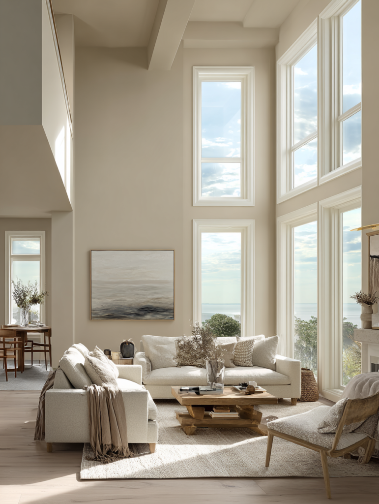
In 2026, harmony leans warm and grounded. Cool grays of the 2010s have given way to greiges, taupes, oatmeals, and khakis that feel inviting and human. These pair beautifully with natural materials—oak flooring, linen textiles, stone countertops—enhancing the quiet luxury aesthetic of restraint and quality.
Psychology plays a key role: Warm neutrals reduce stress and promote calm, while subtle earth tones (olive, terracotta) connect us to nature. Moody accents like deep charcoal or plum add sophistication without overwhelming. The result? Homes that feel expensive, collected, and deeply personal—much like an Old Money estate passed through generations.
Why Whole House Paint Palettes Are Essential in 2026
Open floor plans dominate modern living, making visual flow critical. A mismatched palette creates visual “stops” that make a home feel smaller and disjointed. A unified scheme, conversely, enlarges spaces, improves lighting perception, and simplifies decision-making when selecting furniture and decor.
Timeless palettes prioritize versatility and longevity. They adapt to changing trends through accessories rather than wall repaints every few years. In an era of sustainability and mindful consumption, investing in quality paint (low-VOC formulas from Benjamin Moore, Sherwin-Williams, Farrow & Ball) that lasts and ages gracefully aligns perfectly with quiet luxury values.
Trendy yet timeless 2026 influences include:
- Warm, utilitarian neutrals reflecting a return to grounded living.
- Earthy greens and olives for biophilic calm.
- Creamy ivories and butters replacing stark whites.
- Moody deep tones (charcoal-brown, plum) for drama in smaller zones.
Major brands echo this shift. Sherwin-Williams and HGTV Home chose Universal Khaki (SW 6150)—a versatile mid-tone tan-khaki—for its grounded elegance. Benjamin Moore selected Silhouette (AF-655), a refined brown-charcoal evoking tailored suits. Farrow & Ball leans into sun-baked terracotta with Naperon, while Glidden offers Warm Mahogany for nostalgic depth.
Key Color Families for Timeless & Trendy Harmony
Warm Neutrals (Foundation Layer): Ecru, oatmeal, pale oak, creamy beige, greige, taupe, and khaki. These create serene backdrops that flatter skin tones, wood floors, and natural light. Examples: Benjamin Moore Pale Oak (OC-20), Sherwin-Williams Alabaster (SW 7008) or Natural Linen.
Earthy Greens & Olives: Bridge neutral and color, evoking nature and calm. Perfect accents or secondary walls. Think Behr Hidden Gem or Benjamin Moore Mediterranean Olive.
Soft Whites & Ivories: Melodious Ivory (Dutch Boy) or White Dove (Benjamin Moore) for ceilings, trim, and brightening. Avoid pure bright white for a softer, luxe feel.
Moody Darks & Accents: Silhouette (BM), Universal Khaki deeper variants, or subtle plums/navies for drama in entries, offices, or powder rooms. These add Old Money depth.
Subtle Jewel Tones: Muted teal, dusky pink, or warm mahogany for targeted pops that feel polished rather than trendy.
These families harmonize effortlessly—neutrals as the 60%, earth tones as 30%, and deep accents as 10%.
Curated Whole House Paint Palettes for 2026
Here are four expertly balanced palettes, each with specific Benjamin Moore, Sherwin-Williams, and Farrow & Ball equivalents where possible. They blend timeless Old Money restraint with 2026’s warm, earthy trends.
1. Quiet Luxury Neutrals – Serene & Sophisticated (Best for Minimalist Homes)
Dominant: Warm greige/taupe base for calm flow.
- Walls: Sherwin-Williams Natural Linen or Benjamin Moore Pale Oak (OC-20)
- Secondary: Soft oatmeal/ecru (Benjamin Moore White Dove OC-17 or Dutch Boy Melodious Ivory)
- Trim/Ceiling: Crisp but warm white (Sherwin-Williams Alabaster SW 7008)
- Accent 1: Muted taupe/khaki (Sherwin-Williams Universal Khaki SW 6150)
- Accent 2: Soft charcoal (Benjamin Moore Silhouette AF-655 for drama in small spaces)
- Deep Touch: Warm greige for furniture or feature walls.
This monochromatic-leaning palette whispers luxury. It flatters natural textures (linen, wool, wood) and creates an airy yet grounded feel. Ideal for open-concept living/dining/kitchen areas. In bedrooms, lighten the walls; in studies, deepen with Silhouette for focused elegance.
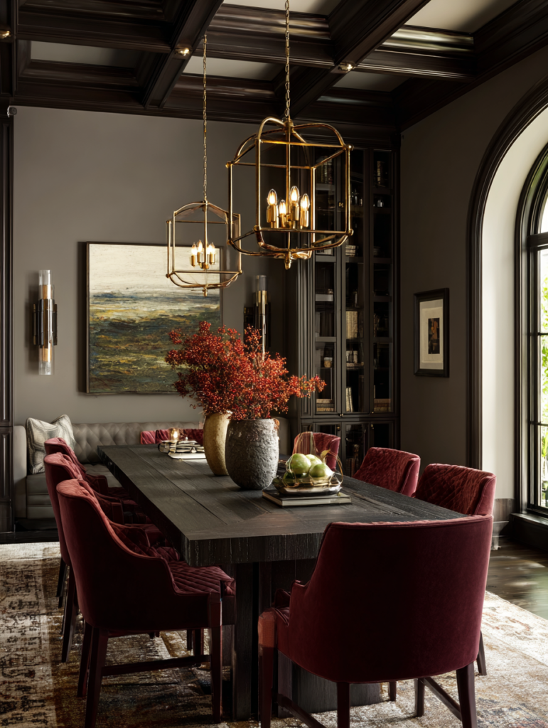
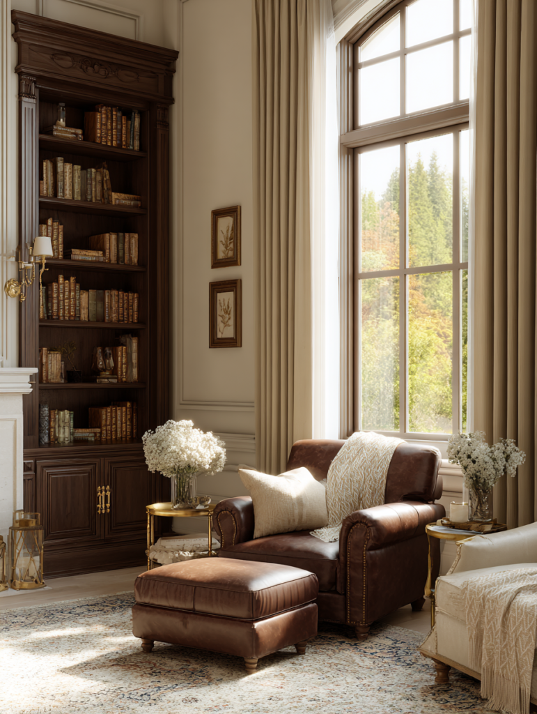
2. Old Money Heritage – Timeless Warm Elegance (Best for Traditional or Transitional Homes)
Dominant: Creamy beige with subtle warmth.
- Walls: Benjamin Moore Pale Oak or ecru-inspired neutral
- Secondary: Camel/taupe (inspired by quiet luxury burgundy-beige pairings)
- Trim: Warm ivory
- Accent 1: Olive or forest green undertones for depth (Benjamin Moore Mediterranean Olive)
- Accent 2: Navy or muted burgundy (subtle jewel for libraries or dining)
- Dark Anchor: Warm mahogany-inspired brown (Glidden Warm Mahogany tones).
Echoing classic estates, this palette layers rich yet restrained tones. Pair with dark woods, brass hardware, and antique rugs for inherited sophistication. It ages beautifully, gaining character over time.
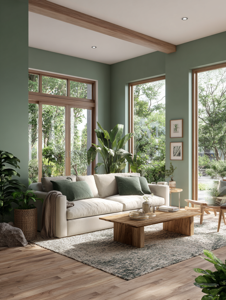
3. Earthy Modern Harmony – Nature-Inspired Calm (Best for Biophilic & Contemporary Homes)
Dominant: Warm khaki with green undertones.
- Walls: Sherwin-Williams Universal Khaki (SW 6150) or similar greige
- Secondary: Olive green (Behr Hidden Gem or Farrow & Ball equivalents)
- Trim/Ceiling: Creamy butter white
- Accent 1: Soft terracotta/peach (Farrow & Ball Naperon-inspired)
- Accent 2: Muted teal or eucalyptus for freshness
- Deep: Charcoal-brown for grounding.
This palette brings the outdoors in, promoting wellness and tranquility. Perfect for homes with large windows or gardens. Use lighter versions in bathrooms for spa-like serenity; deeper olives in living rooms for cocooning comfort.
4. Moody Timeless Contrast – Elegant Drama (Best for Bold yet Refined Homes)
Dominant: Soft neutral base with deeper layering.
- Walls: Light greige or ivory
- Secondary: Warm taupe/mushroom
- Trim: Off-white
- Accent 1: Deep plum/cherry (Graham & Brown Divine Damson vibes) or Silhouette
- Accent 2: Petrol blue-green or navy
- Statement: Warm mahogany or espresso in accent walls/powder rooms.
This scheme balances light and shadow for architectural emphasis. Use in entryways or dining rooms for instant sophistication, then soften with abundant natural light and textures.
Room-by-Room Application: Creating Flow Without Boredom
Living Room & Open Areas: Use your dominant neutral (60%) on walls. Add secondary tones on one feature wall or built-ins. Ceilings in a lighter version prevent cave-like feelings.
Kitchen: Lighter, reflective shades on cabinets or walls (creamy ivory or pale khaki). Deeper tones on islands for definition. Ensure harmony with countertops—warm neutrals pair beautifully with quartz, marble, or wood.
Bedrooms: Softer, more intimate versions of the palette. Layer analogous tones for cocooning (oatmeal walls with taupe bedding). Avoid high-contrast accents here for restful sleep.
Bathrooms: Bright, clean neutrals with subtle green or blue undertones for freshness. Use moisture-resistant formulas.
Hallways & Entries: Slightly deeper or richer tones to create transition and welcome. These spaces can handle bolder accents since exposure is brief.
Home Office/Dining: Moody accents (Silhouette or olive) for focus and elegance. They make Zoom backgrounds look polished.
Children’s or Guest Rooms: Stick to the palette’s lighter end for versatility, adding playful accents via textiles rather than paint.
Lighting matters enormously. Test colors in your actual space at different times of day—north light cools tones, south light warms them. Use peel-and-stick samples (Samplize) for accurate visualization before committing.
Practical Tips for Perfect Implementation
- Test Thoroughly: Paint large sample boards (at least 2×2 feet) and move them around the house. Observe under natural and artificial light (2700K warm bulbs recommended for cozy feel).
- Sheen Selection: Matte or eggshell for walls (hides imperfections, soft luxury feel). Satin or semi-gloss for trim, doors, and high-traffic areas (easier cleaning).
- Undertones Awareness: Warm palettes can shift greenish or pinkish in certain lights—choose carefully based on your flooring and cabinetry.
- Sustainability: Opt for low-VOC, zero-VOC paints. Many brands now offer traceable, eco-friendly lines.
- Budget & Phasing: Start with main living areas, then extend the palette. One hero color can unify everything.
- Accessories & Texture: Color harmony shines when layered with materials—velvet, linen, wood, metal, stone. These add dimension without new paint.
- Common Pitfalls to Avoid: Too many bright whites (feels cold), ignoring undertones, or overusing trend colors as dominants.
The Future of Color Harmony: Timeless Meets Trendy in 2026 and Beyond
As we move through 2026, color palettes continue evolving toward intentionality. Homeowners seek spaces that support well-being, reflect personal values, and withstand time. Warm, earthy neutrals paired with subtle organic tones deliver exactly that—quiet confidence akin to Old Money interiors, where restraint signals true refinement.
Digital tools (virtual painters, AI visualizers) make experimentation easier than ever. Yet nothing replaces real samples and professional advice. Many designers now specialize in whole-house schemes, ensuring perfect cohesion.
Ultimately, the perfect palette doesn’t just look beautiful—it feels like home. It supports daily life, elevates mood, and creates that indefinable sense of harmony where every room welcomes you.
Conclusion: Paint Your Home with Intention and Elegance
Mastering color harmony palettes transforms houses into sanctuaries of timeless style and modern comfort. Whether you choose the serene neutrals of Quiet Luxury, the rich heritage of Old Money, the calming earthiness of nature-inspired schemes, or the elegant drama of moody contrasts, a curated whole-house approach ensures visual peace and sophisticated flow.
Start small: Select one dominant neutral that speaks to you, build around it using the 60-30-10 rule, and test relentlessly. Invest in quality paints and professional guidance if needed. In a world of fleeting trends, these harmonious palettes offer something rare—beauty that endures.
Your home deserves colors that whisper luxury, ground the spirit, and celebrate the art of living well. With these curated palettes and principles, you’re equipped to create spaces that feel both perfectly timeless and refreshingly of-the-moment in 2026 and for decades to come.